From Entrepreneur to Empowerment: My Journey to Health and Purpose”
I’ve always had an entrepreneurial spirit. I sold my first painting while still in high school, and as a young mom married to a coal miner, I was determined to find creative ways to earn extra income from home. Whether it was sewing, crafting, quilting, or painting, I traded my time for money with one-on-one services to support my family.
In my mid-30s, a health crisis led me to explore natural holistic remedies and lifestyle changes, transforming my life in ways I never imagined.
As my children grew and left home, I transitioned to teaching high school, still trading time for money, but I knew there had to be more to life. With broadband internet replacing slow dial-up, I eagerly dove into health and wellness topics, and spent countless hours researching ways to earn extra income. Along the way, I tried a few strategies that didn’t work, but every failure taught me something important.
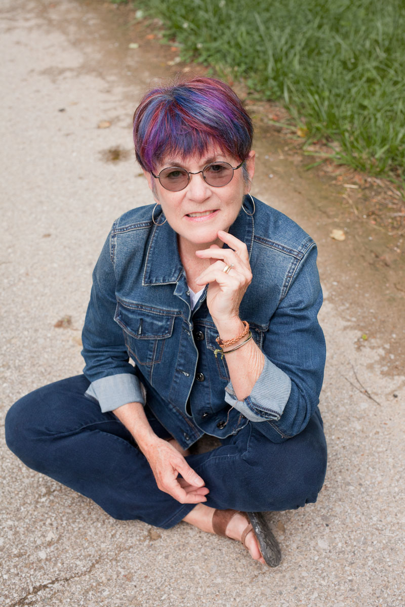
Now, in my 70’s, my mission is clear: to share everything I’ve learned to help other Christian women reclaim their health and discover new ways to serve God. I’m passionate about guiding them away from the overwhelm of endless research and analysis paralysis and showing them how to take action and uncover their true purpose.
Whether you’re seeking stability, taking bold action, building meaningful relationships, or looking for knowledge, this community is for you. We’re here to support you in discovering your purpose and transforming your health, no matter where you’re starting from.
Welcome to a journey of empowerment, growth, and faith.