
Smiling has profound effects on both the mind and body, extending far beyond a mere response to happiness. Scientific research supports that smiling can generate happiness, boost health, and improve social interactions. The facial feedback hypothesis reveals that the act of smiling can influence emotions, tricking the brain into a happier state by releasing neurotransmitters like dopamine and serotonin, which help alleviate stress and anxiety.
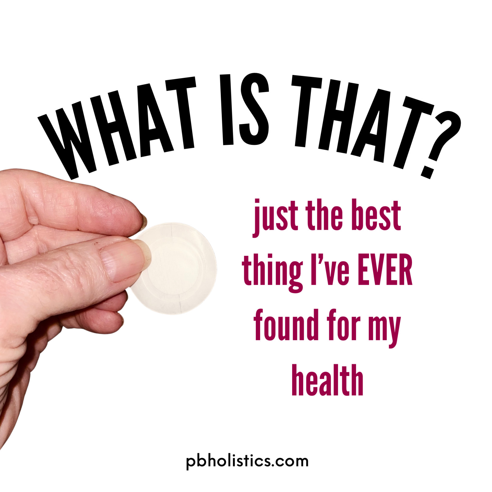
As we age, it often feels like our bodies slow down, with creaky knees and back spasms becoming the norm. But then, you discover something that changes everything—a phototherapy patch that gives you a much-needed boost of vitality.

Looking to succeed in network marketing? After several failed attempts with typical direct sales companies, I found success with a unique, patented product that completely transformed my life. Learn how I turned my network marketing failures into a major win and discovered a skincare solution that actually works. Ready to make your direct selling dreams a reality? Check out my journey and how persistence led to success!
Read more...
Overcoming loneliness when your family lives far away can be challenging, but it’s not impossible! In this post, discover practical tips to stay socially connected.

Common excuses Christians use to avoid assembling together, as outlined in Hebrews 10:25, practical advice for those hesitant to participate in church gatherings, and encouragement to embrace the imperfections and challenges of church communities as part of the rewarding journey of faith.